
Monday, February 27, 2012
Harmony
Thursday, February 23, 2012
Alignment

Emphasis

Before

After
For this assignment we had to try and create emphasis in a meaningful way using color and value. I decided that I wanted to use a repeated image and choose one part to alter to make it stand out. I chose a light bulb because I knew I can add some interesting effects. Within PowerPoint I used a glow effect and made the light bulb more luminous. I also tried to pick up on the gold hue on the bottom of the light bulb to separate it from the other silver light bulbs. I chose to make the glow a yellow tint because I think that is the most recognizable color of a light bulb.
Wednesday, February 15, 2012
Grouping Challenge
For this assignment I had to choose one word to describe myself and then create a poster using 10 components, visuals and texts, to convey my one word. I tried to use repetition by using the same font and placing the words in a position so that they were in a circle and legible. I made the flower the largest aspect of the photo to represent the main focus. Then I sized the words so that they would fit along the petals. I then added the smiley face to try and incorporate my word. Can you guess what it is?


Friday, February 10, 2012
Grouping Assignment
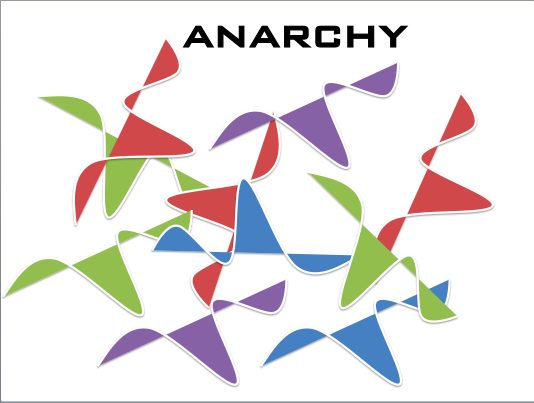
Today's assignment involved grouping similar shapes to evoke a feeling
or emotion. Each picture represents a word and has corresponding shapes to try and evoke the feeling of that word. With each picture I positioned the shapes in specific ways to try and correlate the feelings with the word. I also changed the colors and sizes of the same shape to add to the representation. I also tried to change the font to depict the certain emotion as well as add shadows and glows to create emphasis. Below are the images and my interpretation of the specific theme.


Tuesday, January 31, 2012
"Representation of Self" Banner

For this assignment we were to create a banner of any size through Photoshop to represent ourselves following the concept of the "golden rule." I added the beach across the top because I have grown up going to the beach every summer and it is something that I love to do. I also incorporated JMU because that is currently where I am studying. I inserted a picture of Wilson hall and sent it to the back and made it transparent. Then I added a picture of myself using the magnetic lasso tool and also made myself a little transparent. I then tilted the JMU flag to try and maximize my use of space and made sure to emphasize the colors of purple and yellow. Then I added a quote that I love to tie it all together. This was a challenging assignment as I am still learning on how to use Photoshop but I think I was able to come up with an interesting banner.
Thursday, January 19, 2012
Principles of Visual Design
For this assignment we were to work with each slide containing the before components and alter them to include the visual attributes of Proximity, Alignment, Repetition, and Contrast.
Picture 1:
Proximity- I grouped together the contact information as well as the directions so that people can have the more important details in one area.
Alignment- I aligned the hard edge line to border the main poster title so that it is the first thing that your eye looks to.
Repetition- I gave the main title and catch phrase the same font and then grouped the contact information and directions with a different font.
Contrast- I made the main title much larger than all the other information to catch your eye. I also increased the size of the image to give you something else to look at.
Picture 2:
Proximity- I grouped together similar shapes to create a better understanding of the image.
Alignment- I aligned the shapes within one another.
Repetition- I grouped the similar shapes together and then in increments consistently decreased the size of the shapes within one another for repetition.
Contrast- To contrast the different shapes and filled each one with a different color and added some drop shadow effects to make them stand out.
Picture 1:
Proximity- I grouped together the contact information as well as the directions so that people can have the more important details in one area.
Alignment- I aligned the hard edge line to border the main poster title so that it is the first thing that your eye looks to.
Repetition- I gave the main title and catch phrase the same font and then grouped the contact information and directions with a different font.
Contrast- I made the main title much larger than all the other information to catch your eye. I also increased the size of the image to give you something else to look at.
 |
| Before |
 |
| After |
Picture 2:
Proximity- I grouped together similar shapes to create a better understanding of the image.
Alignment- I aligned the shapes within one another.
Repetition- I grouped the similar shapes together and then in increments consistently decreased the size of the shapes within one another for repetition.
Contrast- To contrast the different shapes and filled each one with a different color and added some drop shadow effects to make them stand out.
 |
| Before |
 |
| After |
Subscribe to:
Posts (Atom)